Brand Background
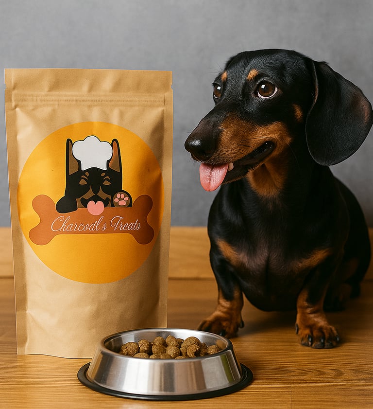
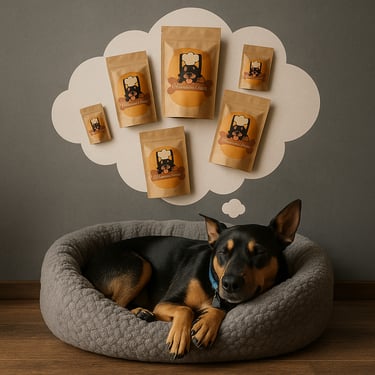
Charcoal’s Treats is a Brisbane-based homemade pet food brand dedicated to offering healthy, organic treats for beloved pets. The founder’s vision was to communicate a deep love for animals and the joy of providing them with natural, wholesome food. Her products focus on quality ingredients, handmade care, and eco-friendly packaging.

Brand Vision
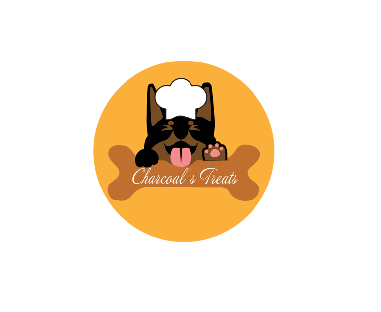
Charcoal’s Treats envisions a world where pets enjoy healthy, natural, and lovingly crafted food. Rooted in the authentic bond between the founder and her beloved dog Charcoal, the brand tells a heartfelt story that resonates with pet owners. The design blends earthy tones and a warm, approachable visual style to stand out in the competitive pet food market, while staying true to the promise of being natural, wholesome, and filled with care.
Brand voice
Use this space to introduce yourself or your business to site visitors. Share who you are, what you do, and the purpose of this website. Feel free to include your background, experiences, and any unique aspects that set your business apart. Highlight your mission, values, and the benefits your customers can expect.
Design challenge
When the project started, the client had no clear visual direction or specific style in mind. She knew she wanted her branding to feel premium yet approachable, but the details were undefined.
Design solution
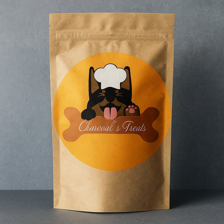
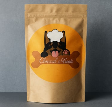
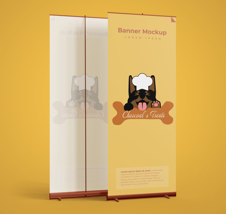
I guided her through a discovery process, asking targeted questions and showing visual concepts to clarify her preferences. As part of my creative approach, I suggested featuring her actual pet dog as the central character in the logo — a decision that instantly gave the brand a personal, authentic identity.